Home

ad Ruby

Main navigation

  • Home
  • Print
  • Outdoor
  • TV / Film
User account menu
  • Contact
  • Log in

Breadcrumb

  1. Home
  2. Tyrolit
  3. Tyrolit - "Done" - grinding, cutting, drilling and dressing tools

Tyrolit - "Done" - grinding, cutting, drilling and dressing tools

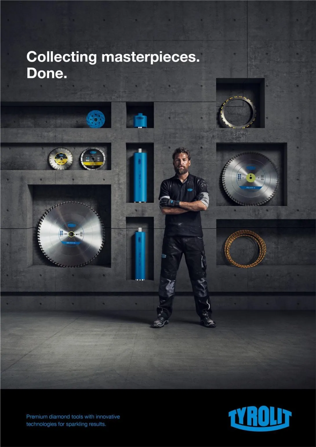
Tyrolit - Collecting masterpieces. Done.
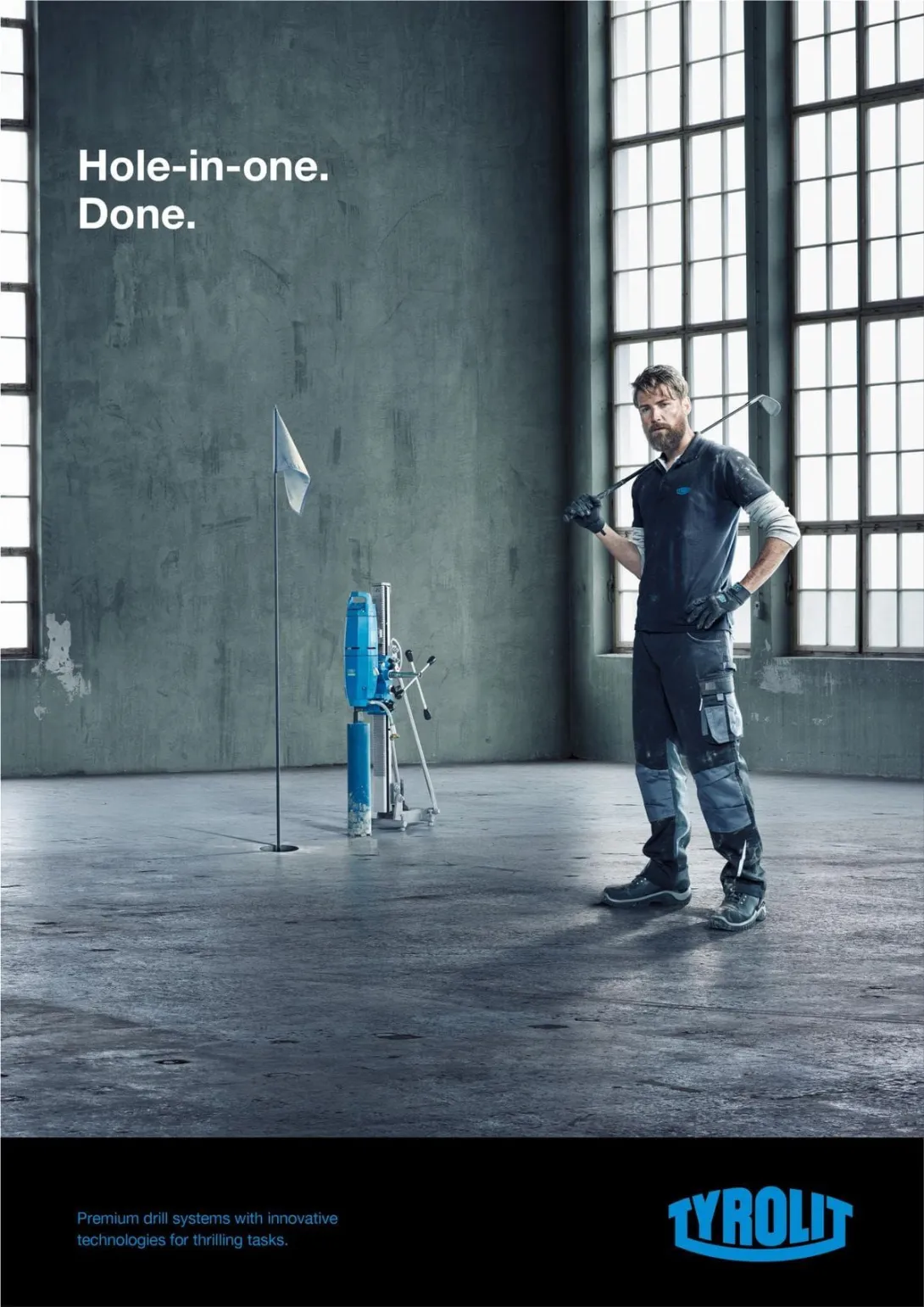
Tyrolit - Hole-in-one. Done.
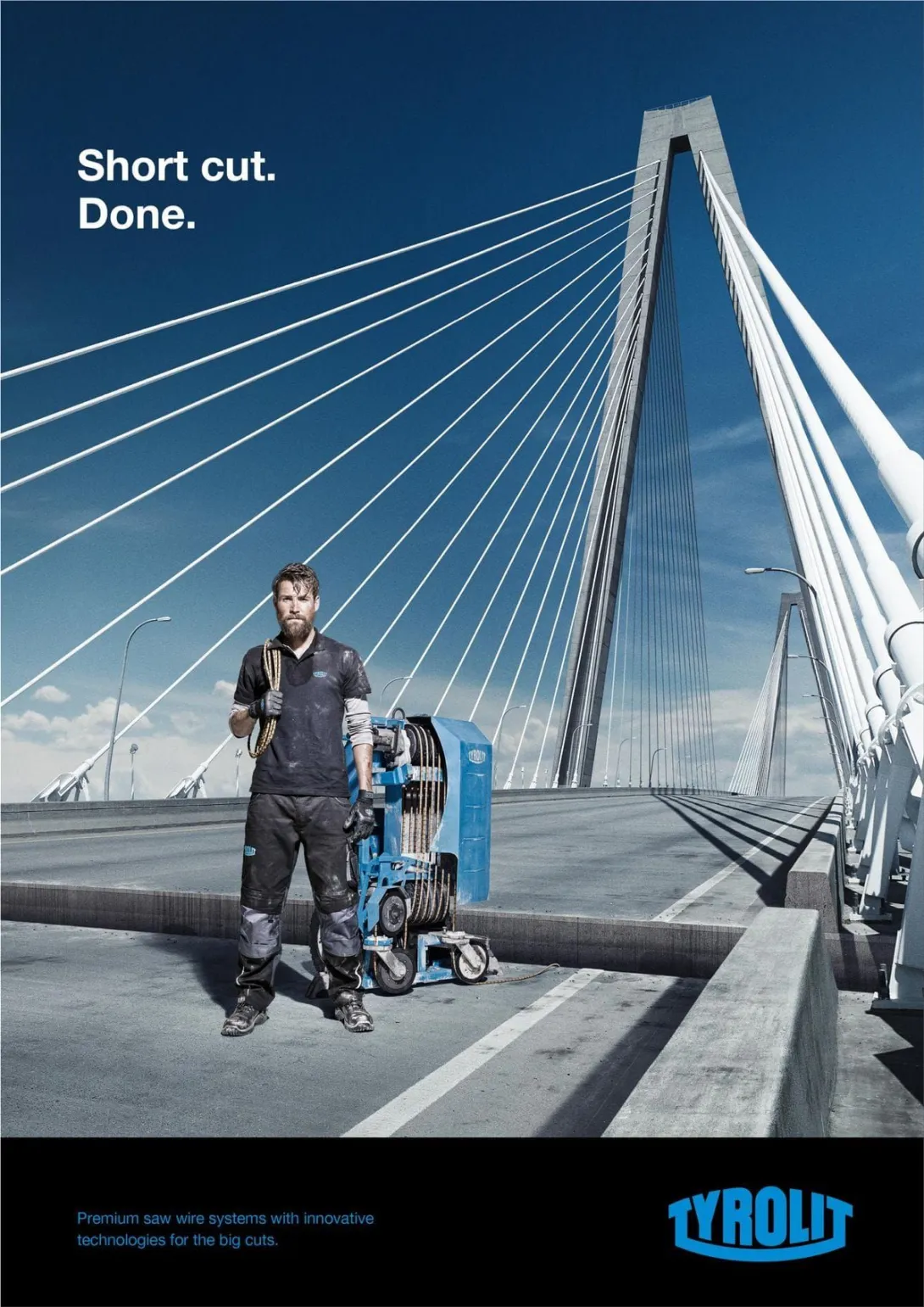
Tyrolit - Short cut. Done.
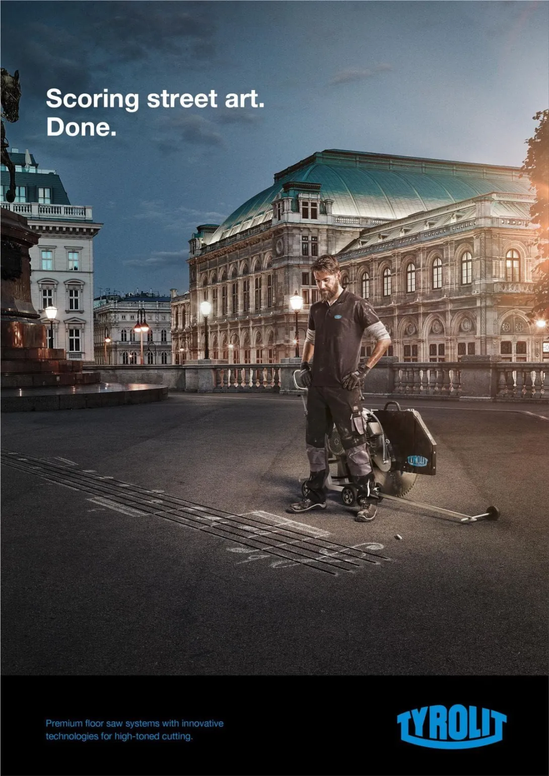
Tyrolit - Scoring street art. Done.
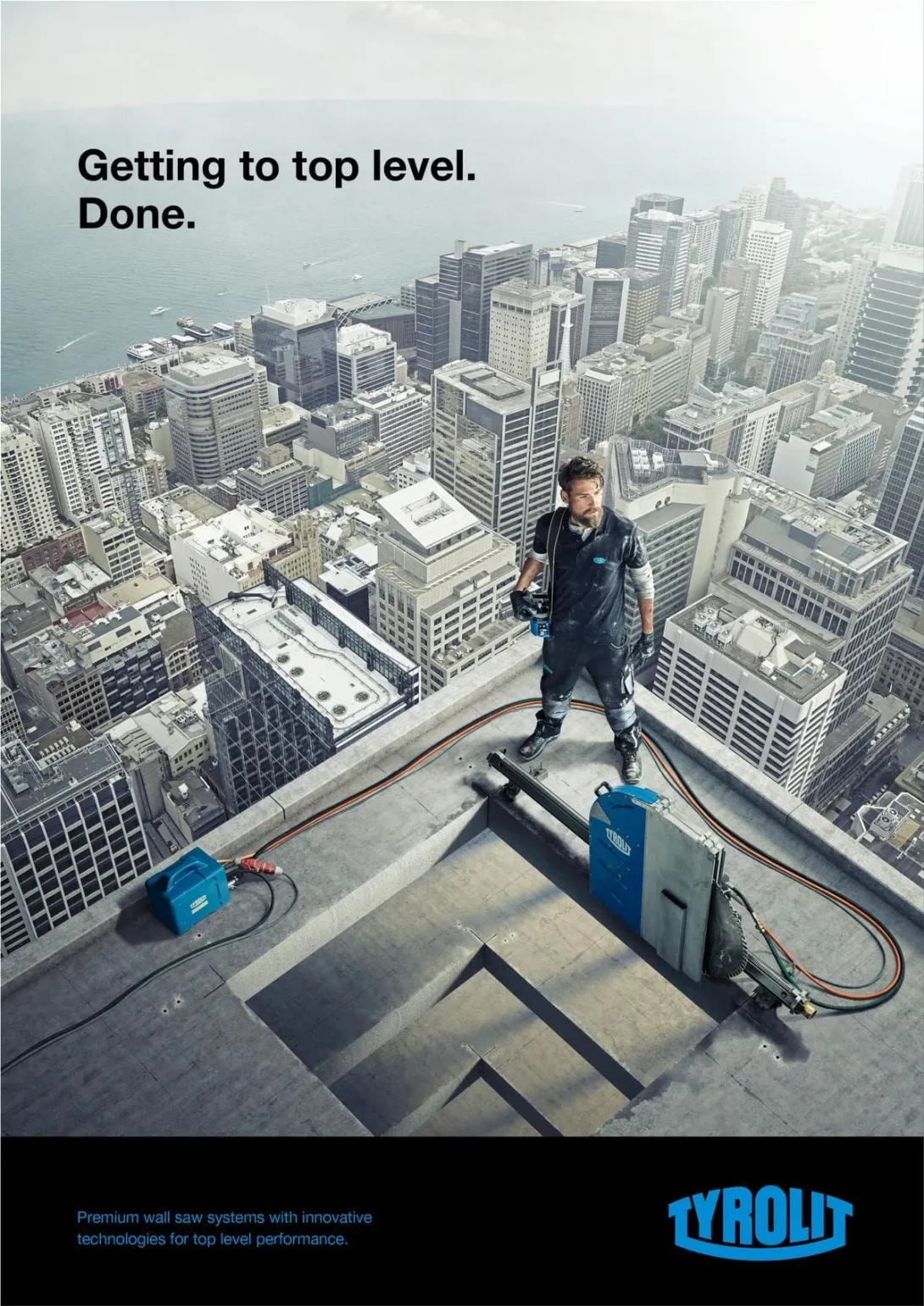
Tyrolit - Getting to top level. Done.

Contrast:
The most obvious example of contrast in this advertisement would be the color of the text. In the upper left we have the contrast between the dark grey background and the stark white, which draws attention to the words. At the bottom of the advertisement we can also see the contrast between the peacock blue words and dark black background, again drawing attention to the brand name and slogan. Some other not as blatant uses of contrast can be seen in the use of circular vs rectangular shapes and the small vs large shape sizes.

Repetition:
The designer of this advertisement also gave great thought to repetition. A few elements can be seen repeated in this image to create a sense of unity and agreement. First, we can see color. The peacock blue of the company’s logo can be seen repeated throughout the Ad, in text and in their tools. This allows the viewer to make connections, from the company to their product. Shapes are also repeated throughout the image, this allows the ad a great visual balance. The font is also repeated therefor connecting the ad from the top to the bottom.

Alignment:
Although alignment can sometimes be tricky to include, this advertisement uses several lines to create unity throughout the image. Running vertically, we can see alignment of the text. Although both sets of text are positioned far from each other, they are connected through an invisible line. Left-alignment something that the viewer is familiar and comfortable with. The body of the image is full of alignment, this gives the photo a clean and organized feel. Once again helping the viewer unify all aspects.

Proximity:
An important element in design is proximity, which can be seen in this advertisement. First, if we look at the bottom we can see that the business logo and slogan are group together, showing the relation between them. Second, at the top we can see another separate element- the advertising slogan, both parts, grouped together so the viewer can know they are related. Then we have the main focus, the product image, all grouped together again so the viewer can make assumptions about what pieces of the advertisement are related to one another.

Color:
The color of this advertisement is fantastic. First, the designer used the colors of the business throughout the project allowing the ad to have a united feeling as a whole. The brightness of the blue contrasts with almost anything in the image allowing it to bring attention to the most important aspect of the ad- the business. The smoked edges and black overlay also give the advertisement an edgy exciting feel, which makes sense with the product being cutting edge power tools.

Conclusion:
In conclusion this advertisement for Tyrolit is amazing. It not only contains all the elements of design, but uses them in a way that shows amazing interpretation of design. The overall effect of the advertisement is clean and beautiful. This advertisement fulfills, if not surpasses, all the requirements and objectives of its creation.

Advertising Agency: Heimat Wien, Vienna, Austria
Creative Director / Copywriter: Christoph Pausz
Creative Director: Georg Feichtinger
Art Director: Simon Pointner
Copywriter: Robin Kappacher
Photographer: Patrick Saringer
Retouching: Mladen Penev

via tbergcomm130.wordpress.com

Country
Austria
Media
Print

Category

  • Industrial & Agriculture

Brand

  • Tyrolit
Ad Agency
Heimat
By adRuby, 10 January, 2018
  • Add new comment
  • 211 views

Similar content

Tyrolit "FLAWLESS. FOREVER."

Tyrolit "FLAWLESS. FOREVER."

A billboard site in Viennas posh first district, where design conscious urban professionals pass by daily on their wa

Xella: "Life's too short to spend a long time with building." by Heimat

Xella: "Life's too short to spend a long time with building." by Heimat

Life’s too short to spend a long time with building.

Advertising Agency: Heimat Wien, Vienna, Austria

Mortein print ads

Mortein: Nowhere left to hide.

Nowhere left to hide.

Yale Locks

Yale: The world's favourite lock

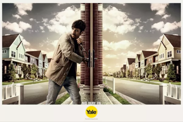
No way in
Yale. The world's favourite lock

Advertising Agency: Grey Group Kuala Lumpur, Malaysia

3M "The tape that crosses through our hearts"

3M "The tape that crosses through our hearts"

Advertised brand: 3M
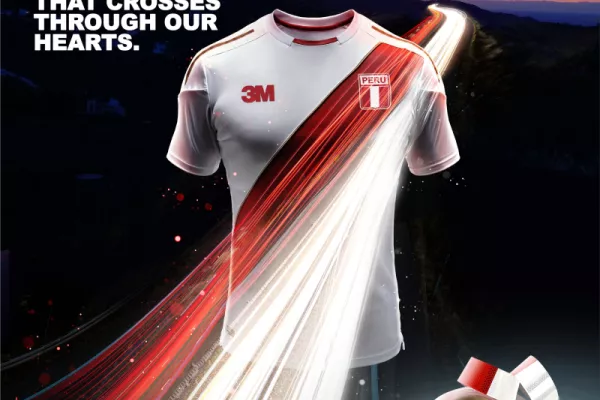
Advert title(s): THE TAPE THAT CROSSES THROUGH OUR HEARTS

Bringing Things to Life

"Brick," is a spot from the Interstate All Battery Center "Bringing Things to Life" campaign, which won a 2012 silver

ComEd: Recycle your old fridge

Watch as Chicago thespians Rebecca Spence, Josh Bywater, and Renee Matthews discover that happiness is a loaded dishw

ekWateur invites you to switch to renewable energy

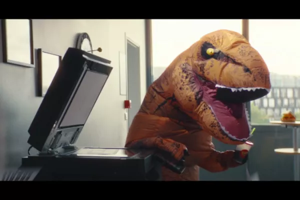
ekWateur - The energy dinosaurs

BIC: Soft Drink

Advertising Agency: BorghiErh/Lowe, Sao Paulo, Brazil

BIC print ads

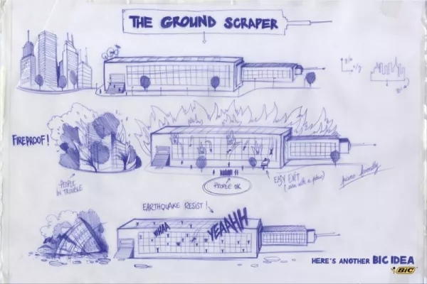
BIC: That's such a BIC IDEA

Client: BIC

Advertising Agency: Publicis, Spain

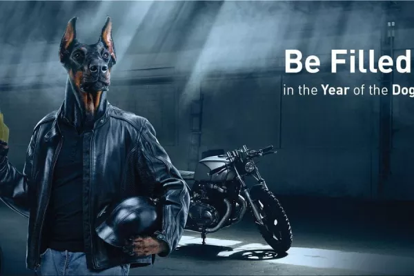
KLO - Be filled up in the year of the dog!

KLO - Be filled up in the year of the dog!

Be filled up in the year of the dog!

Mortein print ads

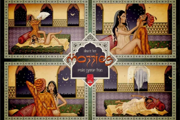
Mortein: Don't let mozzies ruin your fun

Don't let mozzies ruin your fun

AustralBricks

AustralBricks: Timeless style

Advertising Agency: Tango Communications, New Zealand

DISAN Agro "To nourish and care for your seeds"

DISAN Agro "To nourish and care for your seeds"

To nourish and care for your seeds, is giving life to healthy crops.

Client: DISAN Agro

Nataraj Pencils ads

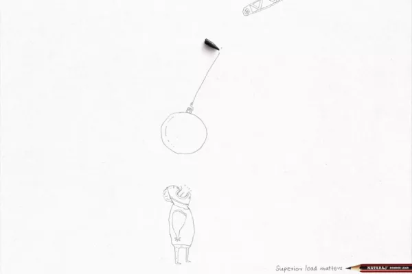
Superior lead in pencils

Superior lead matters

Advertising Agency: Ogilvy & Mather, Mumbai, India

BIC

BIC: Universal Typeface

see the website at http://theuniversaltypeface.com

Advertising Agency: DDB Düsseldorf, Germany

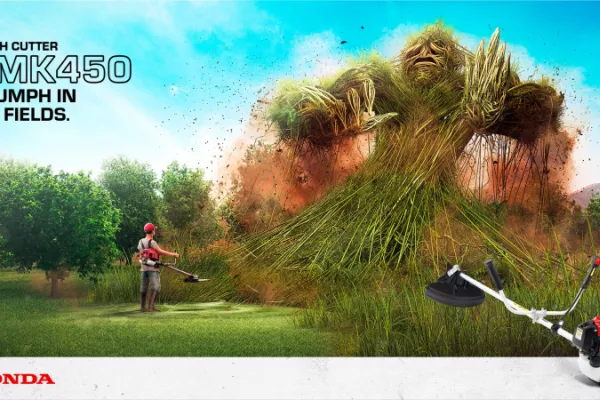
Honda Power Equipment

Honda Power Equipment: the UMK450 trimmer

In Peru, the market for Power Equipments has been evolving in all regions of the country.

BIC ads

BIC: Histories end, Bic doesn't

Histories end, Bic doesn't

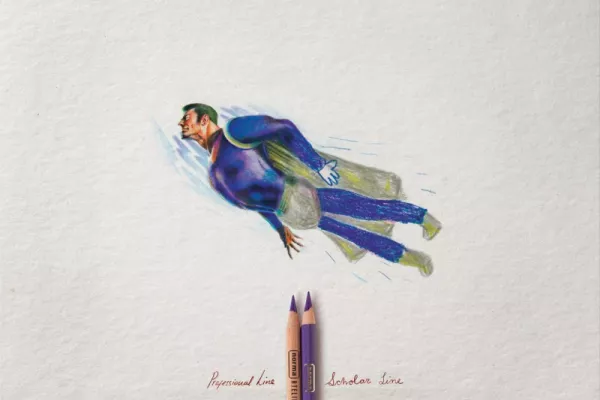
Norma Atelier print

Norma Atelier: Professional Line

Professional Line. Scholar Line.

Client: Norma Atelier

Advertising agency: DDB, Medellín, Colombia

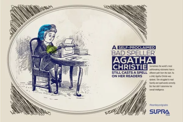
Supra Pens

Supra Pens: "#learnbeyondgrades" by Monkey Wrench

Advertising Agency: Monkey Wrench, India

Like us on Facebook!

ad Ruby

Friends

»Haut Fashion  »Electric Hunter  »Panorica 

Latest news

Rabea’s Trigger Mug: Bridging Tradition and Technology for Gamers

From Silent Statistics to Urgent Action: Inside L’Enfant Bleu’s Child Abuse Awareness Campaign

TUI’s New Christmas Book

A Festive Flight of Fancy: TUI's Elves Take Center Stage in a New Christmas Tale

Brewing a Better Tomorrow: San Francisco Bay Coffee’s Animated Leap into Sustainability

A Bank Ad That Blooms Beyond Banking: Banque Populaire’s New Campaign

Vodafone Celebrates 40 Years of Connections with Nostalgic Christmas Campaign

Waitrose’s Whodunnit Christmas Ad: Sweet Suspicion

#NePasIgnorer: A Campaign That Demands Action Against Violence Towards Women

Toyota BZ4X: Breaking Barriers with the 'Secret Worth Sharing' Campaign

Unforgettable: The Final Serve of Rafael Nadal's Legacy

Pagination

  • Previous page
  • 5
  • Next page

Popular ads

Vodafone Celebrates 40 Years of Connections with Nostalgic Christmas Campaign

Valentine’s Day Marketing Done Right: How Morrisons and Leo Burnett Win Hearts (and Sales)

Diesel print ads

Diesel: Fresh & Bright Superheroes

Heineken "Home Gatherings" by Publicis

SNCF Voyageurs

Celebrating Every Journey: SNCF Voyageurs Debuts a Multifaceted Visual Identity

Idris Elba in Sky Cinema's "Your Ticket to the Big Screen"

McDonald's "i'm lovin' it"

McDonald's "i'm lovin' it"

KFC "Hot & Spicy"

KFC "Hot & Spicy"

Best Friend Forever

Best Friend Forever, focuses on bringing art and essay films to the international market

Ecovia ads

Don't drink/speed/text and drive

Pagination

  • Previous page
  • 5
  • Next page
RSS feed
#McDonald's(129)
#Volkswagen(96)
#Coca-Cola(68)
#Amnesty International(55)
#Samsung(54)
#IKEA(52)
#Audi(50)
#Toyota(49)
#Honda(47)
#Greenpeace(41)
#Pepsi(41)
#Burger King(39)
#Ford(38)
#WWF(38)
#Nike(37)
#Fiat(37)
#Adidas(37)
#BBDO(336)
#DDB(267)
#Ogilvy(239)
#TBWA(218)
#Publicis(202)
#Leo Burnett(180)
#Y&R(174)
#Saatchi & Saatchi(146)
#Grey(133)
#Miami Ad School(130)
#JWT(125)
#McCann Erickson(101)
#Other(88)
#Lowe(62)
#Wieden + Kennedy(60)
#BETC(59)
#Havas(58)
Powered by Drupal